
Most of us, at some point in our lives, have felt some reservations and regret over choices we have made concerning colors to decorate, or redecorate, a room. One person may have an eye for coordinating color combinations while another has a mint-green and neon-yellow family room (true story!). Those of us in that second category can make use of a color wheel to help guide and solidify our choices while giving us the confidence to choose beautiful complimentary hues without regret.
The Color Wheel
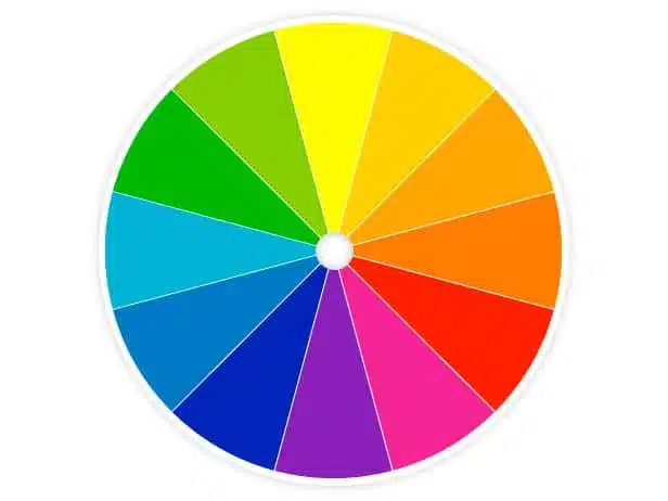
A color wheel is an illustration of a wheel, reminiscent of a pie chart, that organizes colors and places them in order of relationship. Basic primary, secondary, and tertiary colors, or those that occur in a rainbow, form the basis of the chart and your choices of color can be any hues within those colors.
Mint-green walls with neon yellow trim is an acquired taste, but a different hue of green and yellow can turn a mess into a more sophisticated and organized look that you can be proud of.
A color wheel can be used in several ways that will not only help create your ideal atmosphere but also help you become more familiar and comfortable with your personal aesthetic. Learning to use the wheel is like riding a bike; you’ll never forget how to use it once you grasp the basics of color theory.

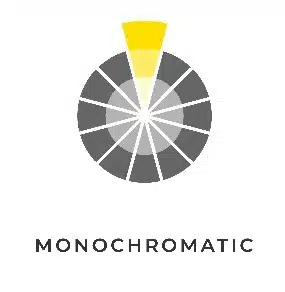
Monochromatic
A monochrome look is very sophisticated and consists of using several shades of the same basic color. This particular strategy can be a little tricky because you are looking at variousMonochromatic Color Scheme hues of the same color and deciding which looks the best together. Many paint chips are organized as light to dark which will help with the monochromatic scheme.
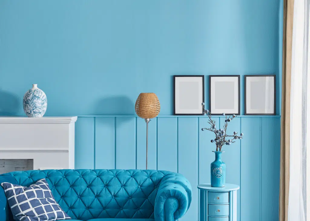
Choose one color that you love and explore the warm, neutral, and cool tones of this particular color, which are all organized in groups on advanced color wheels. You can mix lighter blues with darker blues or even stick with a single shade. The blue living room creates a calm feeling with the layering of different shades of blue.
A white room with beige accents is an example of an elegant monochromatic room that exudes an aura of cultured organization. Mixing variants of black and dark gray touches in a light gray room seems refined, clean, and edited. The trick is not to go too heavy on one color. Balance is key.

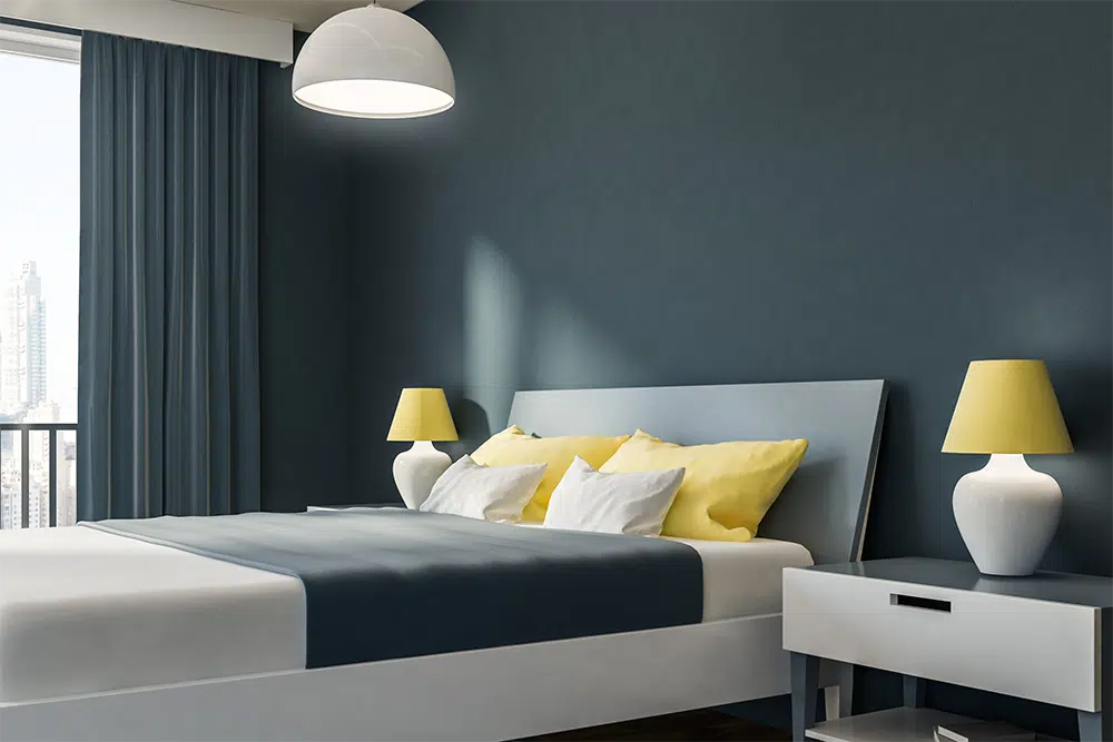
Analogous
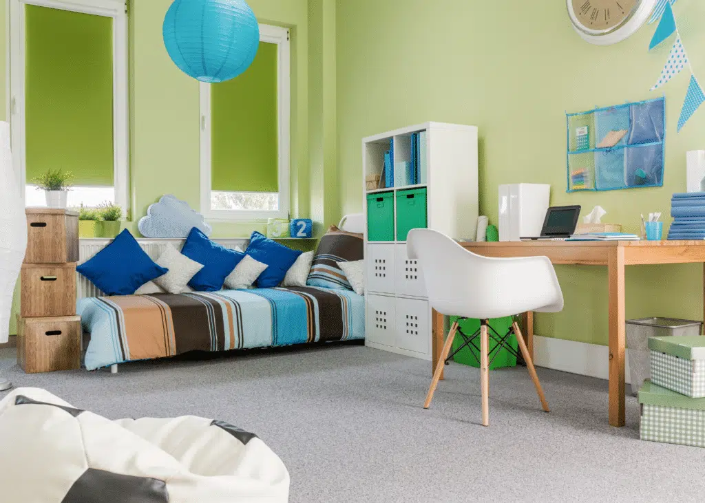
Analogous colors are found next to each other on the color wheel. This particular system adds a little kick to the monochromatic strategy but can make a home feel more comfortable and a little more casual. Again, the strategy is about balance. The bedroom shows using a blue and a green to create a casual atmosphere.
The suggested balance is called the 60-30-10 rule. An average of 60% of your room should contain one main color, dominant, like an anchor. A second color should take up around 30% of space and fully complement the anchor color. Finally, a third color should take up about 10% of your decorating scheme.
Accents comprised of complimentary shades in secondary colors yellow and green are beautiful against simple white walls and furniture. Choose cool tones and subdued colors for a calmer feel and warmer or deeper colors for a more energetic environment.

Color Wheel – Complementary Colors

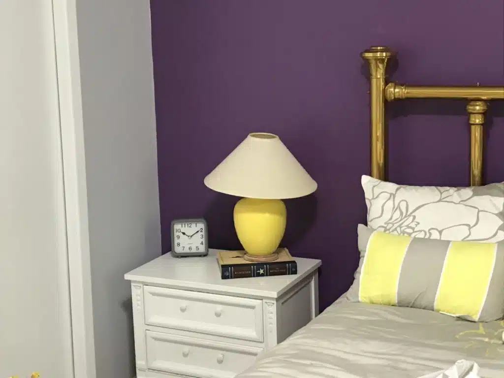
Complementary colors lay opposite each other on the color wheel, and they balance each other out. The color combinations are visually bold and best when each color is represented equally. This strategy brings warmth and even more comfort to your design theme.
Combinations of complementary colors tend to be fun. Blue and orange are a popular combination that elicits a sense of energy while red and green can cause us to feel warmth and a sense of joy. Many shades of these colors look amazing against a neutral background and can brighten up any space.
Our mix of gray with purple and yellow is the perfect use of a complementary color scheme.
Triadic
A triadic scheme adds a sense of chaos and extreme comfortability to any room. The trick is to find your favorite three colors that are spaced evenly around the wheel. You can mix warm, cool, and neutral tones that strike an inviting and informal balance.
This strategy, in particular, is for the most adventurous of us and the combinations are always vibrant, happy, and energetic. This eclectic style gives you more choices when it comes to finding pieces to furnish your room and causes you to feel and seem more down-to-earth and open to change.

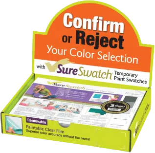
Using SureSwatch® to Apply Your Color Theory
Utilize SureSwatch Temporary Paint Swatches to guide you in choosing beautiful and unique color combinations with our paintable clear film. You can see how your colors will look together in any room and in any lighting without having to actually apply paint directly to your walls. Just paint your SureSwatch®, try & decide & remove.
Contact us at SureSwatch for guidance on how to complete your projects in an efficient, quick, and beautiful way.

About the Author
Always a problem solver, Jamie Peltz looks at common everyday problems from a different perspective. After 17 years of working for a corporation, Jamie found herself unemployed. She saw this as an opportunity to follow her dream to become an entrepreneur. Over the years she and the team have received multiple patents and have been able to commercialize a few of their inventions.
Jamie is a graduate of The Ohio State University and received her MBA from John Carroll University. She also participated in the Goldman Sachs 10,000 Small Business Program and is currently Treasurer for NAWBO- Cleveland (National Association of Women Business Owners). In addition to her work, she enjoys hiking and spending time with her family.

